Getting All The Right Angles With Jamie Naugle Interiors
I recently had the pleasure of photographing for Jamie Naugle Interiors, on an interior design photo shoot of one of her client’s bedrooms she put together. This was part of a project Jamie named the Brentwood Bungalow.
When working with interior designers, you approach it with a different mindset than residential photography for real estate. I am constantly reminding myself that the shoot is just as much about the designer’s work as mine, if not more so the former.
By nature, the job of an interior designer is actually somewhat similar to mine: take the personality of a property and transform it, while listening to the clients’ requests and feedback along the way.
I got the chance to talk with Jamie about her business which I was very curious about: what sort of struggles she faces, overhead costs, common obstacles, etc. On the surface, our businesses are very similar. We both work day in and out to expand our networks, find and retain clients, and pay overhead costs while juggling practically every other aspect of the business we can. We even shared different marketing strategies with each other. In the past I’ve worked in corporate environments and therefore can relate well to my office-dwelling clients. I feel a strong sense of camaraderie and understanding with my fellow freelance clients as well.
Moving on to the shoot:
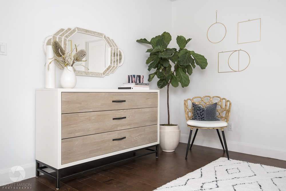
We started experimenting with different angles of this corner. We decided to include these modern-looking golden form pieces on the wall, and re-hung them a few times to get just the right height.
There was much deliberation about how much, if any of the golden square on the right to crop. This sort of photography takes a lot of consideration and careful composing, and it’s my opinion that the designer should have just as much say as the photographer in these matters. After all, it is their hard work you’re photographing.
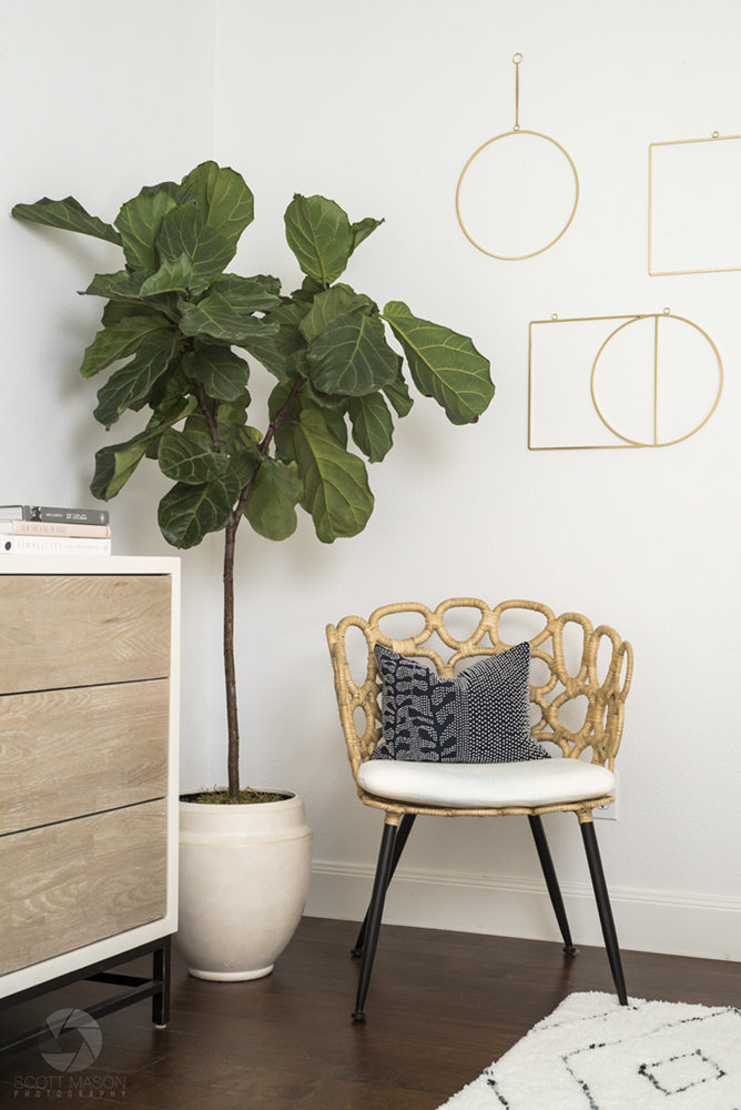
The plant was actually not doing well. Here’s what it looked like before I edited some life back into it:
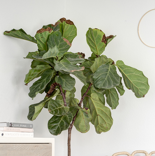
To get geeky for a second, I used a combination of clone stamp, healing brush and color brush on a separate Photoshop layer to fix the browning leaves.
Next is the quintessential wide room shot from the corner.
Somewhat heavy barrel distortion was fixed via Lightroom, and I gently blended in a few flash exposures to give the room more “pop”. I am partial to flash, but I tend to tone it down when it comes to interior design photography because the overarching style of this genre utilizes natural light. This was another situation where I asked the designer, Jamie, if she preferred the more “flashy” version or natural version. Jamie chose the latter and I happily obliged.
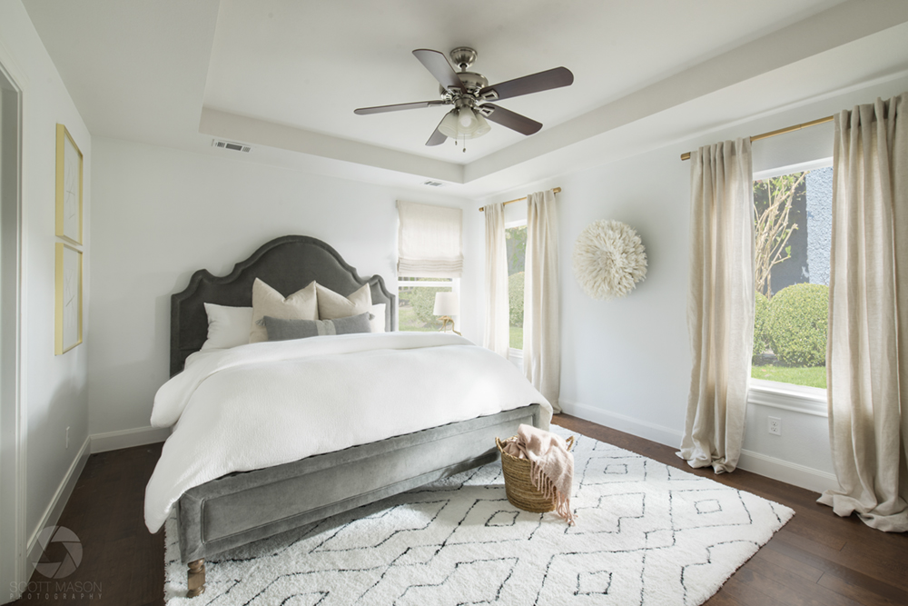
By the way, the window views were Photoshopped in as well. Could you tell?
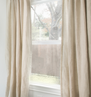
The “true” window view.
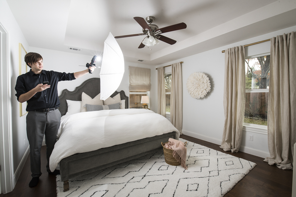 Blam! Hand-holding a trusty SB800 flash with an umbrella. The flash was set off by a wireless hotshoe trigger.
As you may already know, interior design photography incorporates a lot of one-point perspective.
Luckily, the camera and mirror were at sufficiently differing heights that I didn’t have to edit out and interior refection.

What’s the alternative to a one-point perspective? Dynamic composition.
While we don’t have a whole lot of (visible) lines below, the lines are implied. It’s one perspective or the other, anything in between the two compositions tends to look awkward.
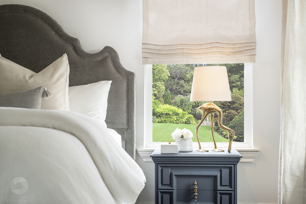
The lamp/nightstand and bed combo was something Jamie wanted to make sure we captured impressively, and I don’t blame her! What a unique lamp — no way I could skip that detail.
The image below is also a window replacement, and when it came down to deciding to “wash it out” a bit like the last one, I didn’t go too far. Realistically, one side of the house could be getting blasted with sunlight while the other view is unfiltered by light, and that’s what I conveyed with this approach. It simply looked better to my photographer’s eyes, anyway.
Finally, below we have a “cropped” view (50mm lens) of these two art pieces and the bed.
It was the simplest composition of the day, which naturally took the least amount of time to set up. As much as I love flash, there was really no need to use it here so I kept it 100% natural light. The light that was coming in was soft — the ideal light. Instead, I blended about 3 ambient (no-flash) exposures together to produce all the detail I could.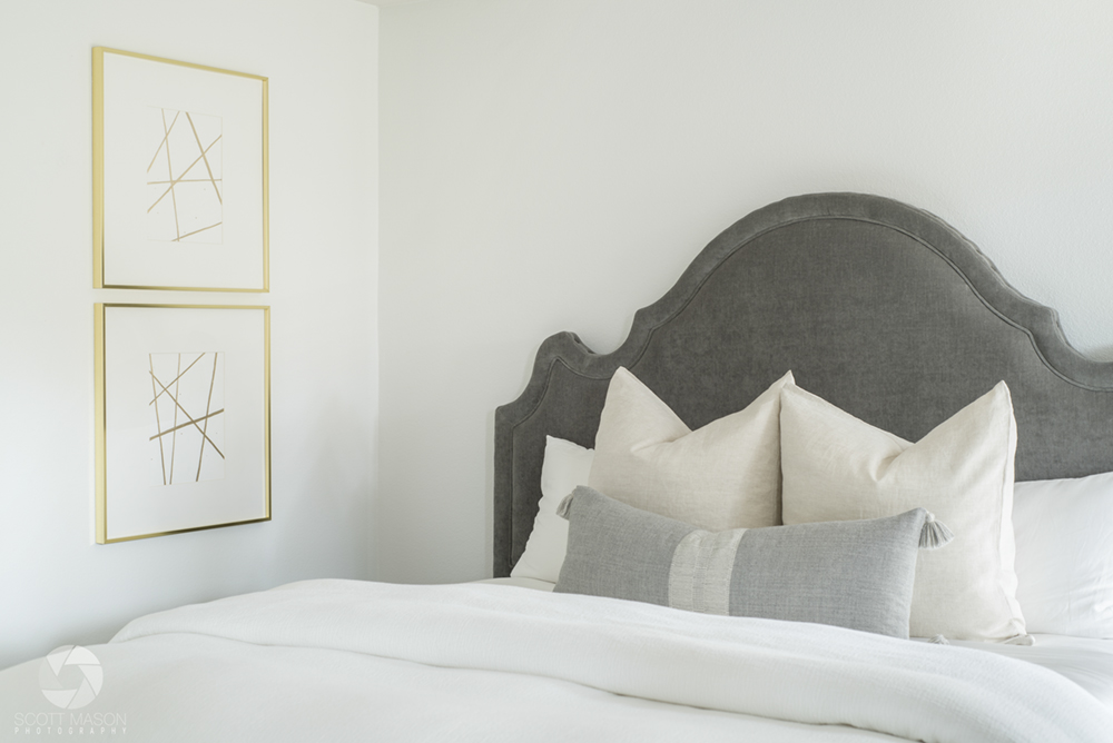
Do you have a question about professional interior design photography, or are you interested in using it to showcase your work?
Click here to contact us and let’s talk about your upcoming project.
Other similar articles:
Flea Market Decor Halloween Shoot for Engaged Media Magazine
Modern Austin Interior Design Shoot
Residential Real Estate Photo Shoot


Pacific Shore Stones – Neolith Tiny House Opening | Architecture & Real Estate Photography - Scott Mason / 2 February 2018 9:59
[…] Interior Design Photo Shoot – Jamie Naugle Interiors […]